Thinking
Design perspective.
Shared openly.
Practical articles on SaaS UX, dashboard design, and building products that users actually understand. Written without fluff.
9 Articles
Why SaaS Empty States Lose Users Before They Begin
Most SaaS products treat empty states as blank screens. They are the moment a user decides whether your product is worth staying for. Here is why teams keep getting this wrong.
Why SaaS Search Fails the Users Who Need It Most
Teams add a search bar after the product is built and call it done. The result is a feature that technically works and practically fails anyone who relies on it daily. Here is what actually goes wrong.
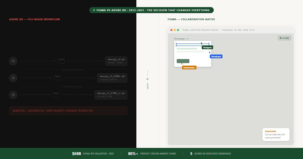
Why Adobe XD Failed: The UX Decision Figma Made That Adobe Couldn't Copy
Adobe had Creative Cloud, decades of brand trust, and launched the same year as Figma. By 2023, Adobe XD had five employees and a $1B breakup fee. This is the one decision that made the difference.
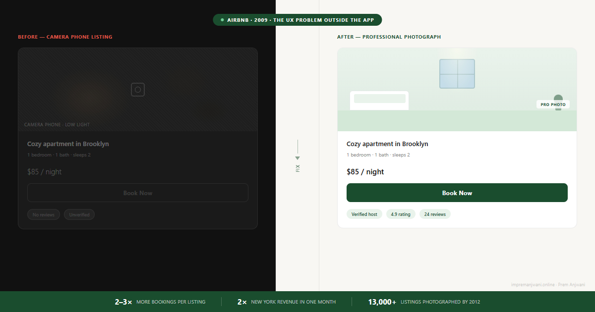
How Airbnb Found the UX Problem Nobody Was Looking For
In 2009, Airbnb was live with real demand in New York but bookings were stalling. The founders flew out, met 24 hosts, and found the problem had nothing to do with the app. This is what they found.
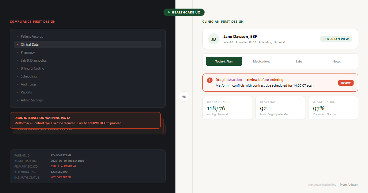
Why Healthcare Software Fails Clinicians - And What Good EMR UX Actually Looks Like
EHR systems score 45.9/100 on usability - bottom 9% of all industries. The problem is not the technology. It is that clinical software is designed for compliance officers, not the people caring for patients.
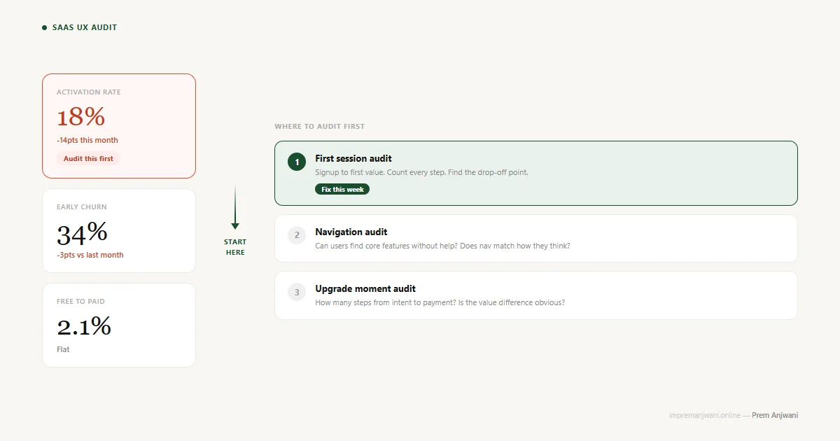
How to Run a UX Audit on Your SaaS (And What to Fix First)
Most SaaS UX audits waste time on 100-point checklists. Here is how to find the 3 areas actually killing your metrics - and fix them in the right order.
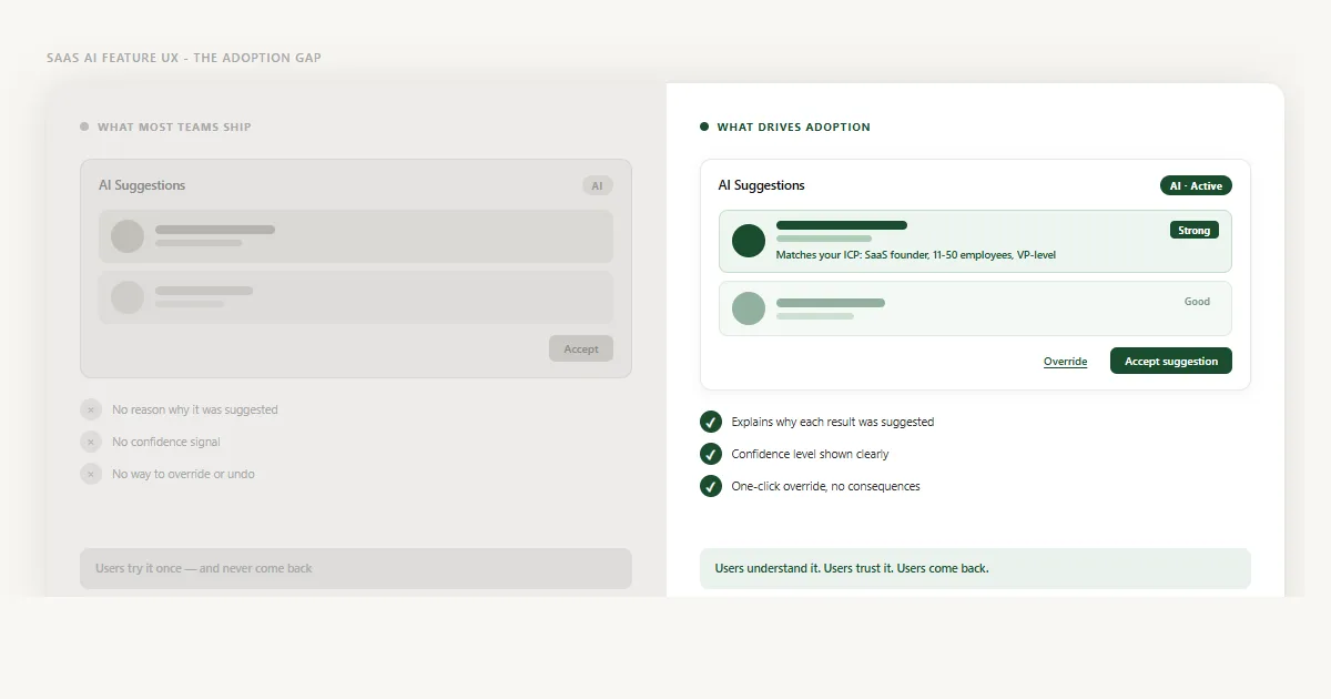
Why Nobody Uses Your SaaS AI Features (It's a UX Problem)
68% of SaaS AI features have under 25% adoption - not because the AI fails, but because the UX around it does. Here is what is going wrong and how to fix it.
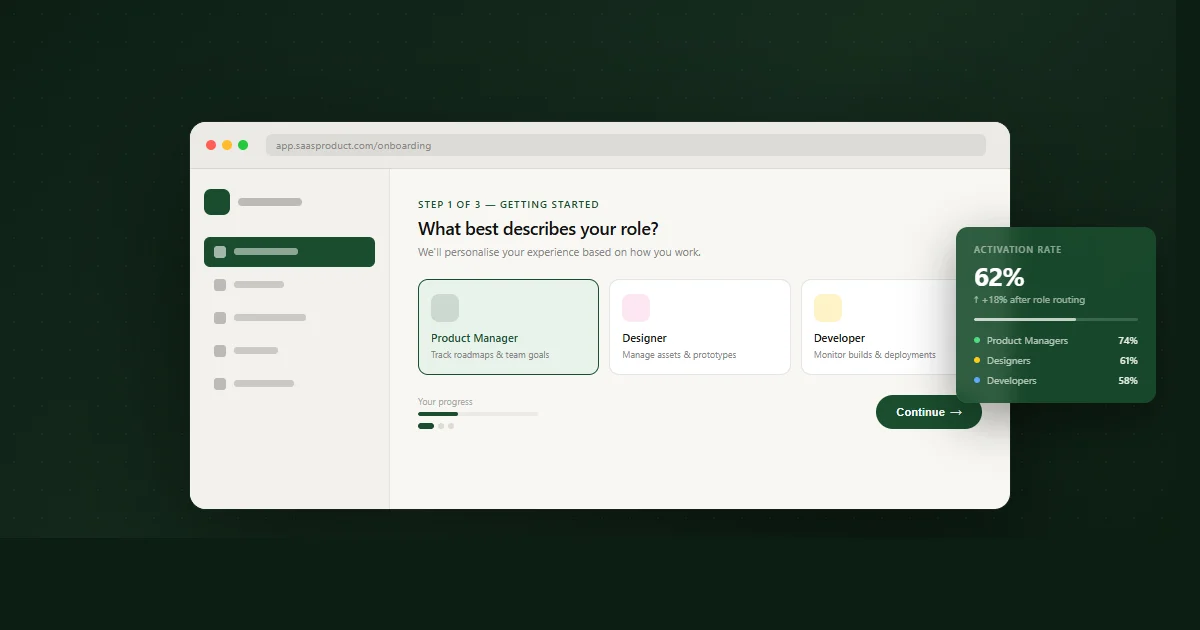
Why SaaS Onboarding Fails - And What Actually Drives User Activation
40–60% of SaaS signups never return after session one. The problem isn't your product - it's an onboarding philosophy built around the wrong goal. Here's what actually works.
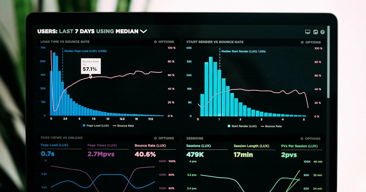
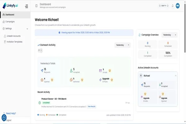
Why SaaS Dashboards Fail Their Users - And How to Actually Fix Them
Most SaaS dashboards are designed to impress during a demo. Then real users show up on day two and freeze. Here's why it keeps happening - and the exact fixes that turn a confusing dashboard into one people genuinely want to use.