What is TravelMate?
TravelMate is a mobile travel companion that solves two problems simultaneously: organising your itinerary and discovering experiences you wouldn't find on a typical tourist list. The app suggests hidden gems based on the destinations a user is already planning to visit - making unexpected discovery a natural part of the planning process rather than a separate research task.
The client had a clear product concept and handled the initial UX direction. My role was to translate that vision into a high-quality mobile UI - one that felt as exciting as travel itself while remaining functional and easy to navigate. When the client later paused the project, they gave permission for the work to remain in my portfolio.
Making discovery feel natural, not like a feature
The core UX tension: travel planning apps are organised and structured, but travel discovery is serendipitous and emotional. The UI needed to hold both qualities without feeling split - a planning tool that still sparked excitement.
Two modes, one flow
Itinerary management (structured, task-based) and destination discovery (visual, emotional) needed to coexist in a single coherent navigation structure.
Mobile-first content density
Travel content is inherently rich - images, locations, schedules, maps. Showing enough to be useful without overwhelming a small screen required careful hierarchy decisions.
Hidden gems UX
The suggestions needed to feel like personal recommendations, not an algorithm. Visual presentation of destinations had to feel curated and trustworthy.
Schedule + calendar integration
The itinerary management screen needed to connect to Google Calendar - requiring a clear, simple UI for what is typically a complex integration.
Visual-first, structure underneath
The design language leads with bold destination photography - travel is visceral and the UI should feel that way. Structure (schedules, lists, forms) sits underneath the visual layer, accessible when needed but never dominating the experience.
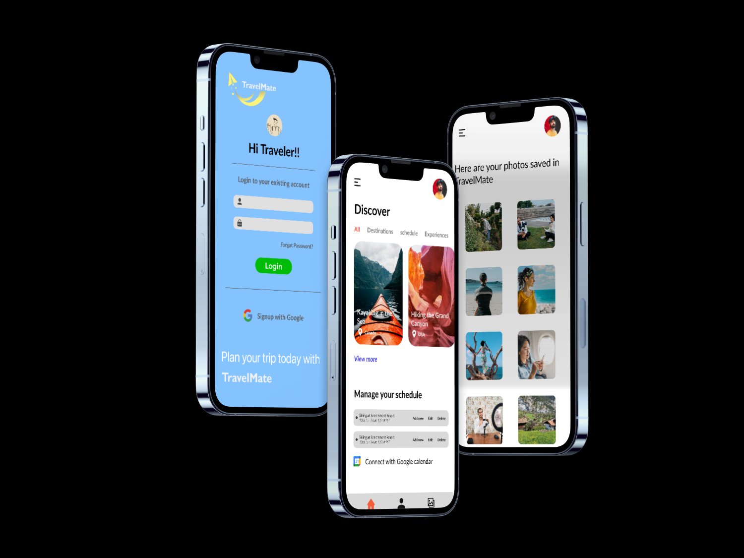
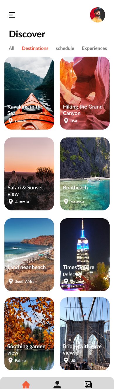
Discovery feed as the home screen anchor
The home screen leads with the Discover feed - a visually rich grid of destinations categorised by All, Destinations, Schedule, and Experiences. Users feel inspired before they start planning.
Integrated schedule management
Below the discovery content, the home screen surfaces the user's current schedule - upcoming trips, editable entries, and a Google Calendar connect prompt - so planning is always one scroll away.
Destination detail with photography-led layout
Individual destination screens use full-bleed imagery with location tags, making each destination feel like a curated recommendation rather than a database entry.
Web landing page for app discovery
Designed a marketing landing page where users learn about TravelMate and download the app - consistent visual language with the mobile app but adapted for a wider screen format.
The fundamental design challenge with travel apps is that two different emotional states live in the same product. Planning is goal-directed and logical. Discovery is open-ended and emotional. A UI that serves only one of these feels incomplete. The solution was to lead with the emotional layer - large photography, destination cards, curated suggestions - and let the structural layer (schedules, lists, integrations) sit beneath it, accessible when needed without dominating the screen.
The decision to connect itinerary management to Google Calendar had a significant impact on information hierarchy. Calendar data meant structure and precision - times, dates, durations. Discovery content meant mood and inspiration. Keeping these two data types visually separated on the home screen, while accessible from a single navigation, was the core layout decision that held the product together.
Why it was built this way
The deliverables tell you what was built. These are the decisions that shaped why it was built that way.
Decision 1: The discovery feed, not the itinerary, opens the app. Most travel apps open on a list - trips planned, places saved. TravelMate opens on the Discover feed. This reflects the product's core value proposition: not better list management, but better discovery. Opening on the feed means users encounter TravelMate's differentiation from the first screen, not after navigating past something that looks like every other travel app.
Decision 2: Photography is the primary navigation signal, not decoration. On destination screens, the full-bleed image is the first UI element - not supporting imagery. This was deliberate: in a category where most apps feel utilitarian, visual weight communicates curation and trustworthiness without requiring copy to do that work. A destination that looks beautiful in the app creates the same emotional signal as a genuinely good recommendation.
Decision 3: Calendar integration is surfaced on the home screen, not buried in settings. Most apps treat calendar sync as a settings feature users discover later. In TravelMate, the Google Calendar connect prompt is part of the home screen schedule section. The reasoning: if users don't connect their calendar, the itinerary section has no data, which makes the app feel incomplete on first use. Surfacing it early - without making it mandatory - means users who want the full experience encounter it naturally.
Selected screens
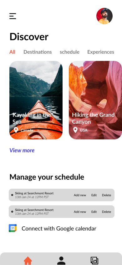
Home - discover feed + schedule
Destination discovery screen