From confusing to conversion-ready - redesigning an AI SaaS platform from the ground up
How a full UX overhaul of Linkyfy.ai transformed a hard-to-navigate outreach tool into a product that can compete in a crowded AI SaaS market.
What is Linkyfy.ai?
Linkyfy.ai is an AI-powered LinkedIn prospecting and email outreach automation SaaS platform. It enables founders, CXOs, sales teams, and consultants to automatically generate hyper-personalised LinkedIn connection messages and emails - matched to each prospect's ICP profile, tone, and role - at scale.
The product sits in a competitive market alongside established outreach tools. To win, it couldn't just work well - it had to feel effortless from the first login.
A powerful product buried under confusing UX
Despite strong core functionality, the existing platform struggled with clarity and usability. Non-technical users - the primary audience - couldn't navigate it confidently. The team was repeatedly explaining flows that should have been self-evident.
The root cause wasn't that the product had been built carelessly. It had been built feature-first - each capability added when it was ready, without a consistent design layer holding the experience together. The result was a platform that worked technically but had no coherent mental model for a new user to follow. Non-technical founders, CXOs, and sales teams - the exact people Linkyfy.ai was built for - were expected to figure out an interface that assumed product familiarity they didn't have.
No clear user flow
Users couldn't tell what to do first, second, or next. The platform's logic wasn't visible in the interface.
Overloaded forms
Key actions required too many steps. Complex multi-field forms created friction and drop-off at critical moments.
Weak visual design
The UI didn't reflect the quality of the product. It looked unpolished next to competitors and undermined trust.
No onboarding guidance
New users were dropped into the platform with no orientation - no tour, no tooltips, no contextual help.
Research first. Design second. Strategy throughout.
I treated this as a product design engagement, not just a visual refresh. Before opening Figma, I invested time understanding the market, the users, and what competitors were doing well - and where they fell short.
Competitor Analysis
Audited leading LinkedIn outreach and prospecting tools - including Expandi, Lemlist, and Dux-Soup - mapping their onboarding flows, dashboard patterns, and ICP setup UX. This defined clear differentiation opportunities and established the design bar Linkyfy.ai needed to beat.
UX Research & User Flow Mapping
Mapped the end-to-end user journey - from ICP setup through prospecting, message generation, and outreach dispatch. Identified all friction points and dead ends in the existing flow.
Information Architecture & Wireframes
Rebuilt the navigation and screen hierarchy from scratch. Created low-fidelity wireframes to validate flow logic before committing to visual design.
High-Fidelity UI Design
Designed 20+ polished screens in Figma - dashboard, ICP setup, campaign builder, message editor, analytics, and settings. Introduced a modern visual language that communicates quality and trust.
Onboarding Flow + Tooltips
Designed a guided onboarding tour for new users - contextual tooltips, empty states, and progressive disclosure - so any non-technical user could get started confidently without support.
Design System & Handoff
Built a scalable component library and design system in Figma - reusable components, typography scale, and spacing tokens - so the dev team could build fast and stay consistent.
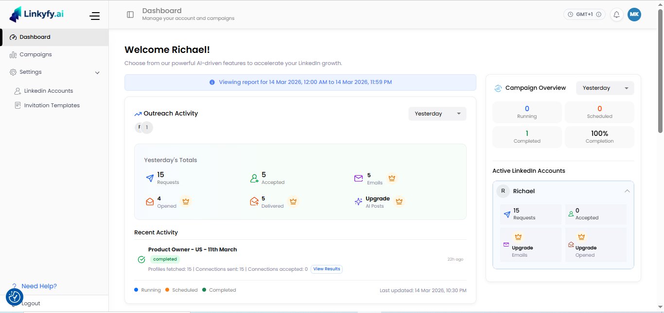
Dashboard - outreach activity, campaign overview & account stats
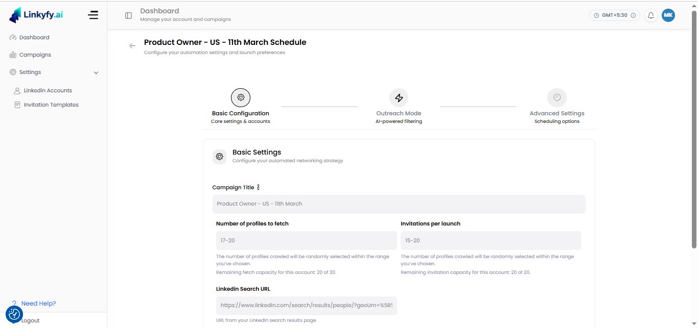
Campaign builder - 3-step configuration flow
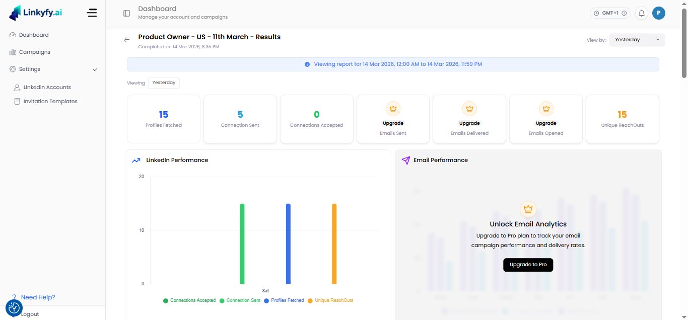
Campaign results - LinkedIn & email performance analytics
Why it was built this way
The deliverables tell you what was built. These are the decisions that shaped why it was built that way.
Decision 1: One primary question for the dashboard. Before designing a single screen, I asked: what does a returning user need to know in the first five seconds of logging in? For Linkyfy.ai's primary users - founders and sales leads running outreach campaigns - the answer was campaign health: are my active campaigns running, and are they performing? Everything else on the dashboard was reorganised around that answer. Engagement stats, account settings, and secondary analytics moved to supporting positions. The primary visual element became campaign status. This single hierarchy decision changed the experience of logging in from a scan across equal-weight elements to an immediate answer.
Decision 2: Break forms into steps, not just fewer fields. The existing campaign builder required users to make too many unrelated decisions in one view. The instinct is to solve this by removing fields. The better solution is to separate decisions by type: what this campaign is for, who it targets, how it should sound. Three screens, each asking one category of question. Users who had abandoned the original builder because it felt overwhelming could complete the redesigned flow without friction - not because the product asked for less information, but because it asked for the right information at the right moment.
Decision 3: New users are a separate design problem. The returning-user dashboard and the first-session experience are two different products. Showing a new user an empty version of the returning-user interface - blank charts, unpopulated metrics, inactive campaign slots - communicates nothing useful. The redesign treated first-session users as a distinct audience with a distinct need: get to a first real action as quickly as possible. The interface they see on day one is built around that goal. The full dashboard appears once they have something to show.
What changed, concretely
The pattern across every "After" item is the same: remove the decision the user shouldn't have to make, and replace it with a clear path to the one they should. The internal team no longer needing to explain features isn't a soft win - it is evidence that the interface itself is doing the work it was supposed to do. When a product requires a human to stand next to it and translate, the design has failed. That is what the redesign fixed.
Results that mattered to the business
This wasn't a cosmetic refresh - the redesign directly impacted how users experience the product, how the team communicates it, and how it competes in the market.
What was handed off
Every deliverable was production-ready and built for a development team to build from directly - no interpretation required.
Frequently Asked Questions
What does a SaaS dashboard redesign include?
A SaaS dashboard redesign includes a UX audit of the existing interface, competitor analysis, user flow mapping, wireframes, high-fidelity screen designs, and a dev-ready Figma handoff. The Linkyfy.ai redesign covered 20+ screens - dashboard, onboarding wizard, campaign builder, and analytics - plus a complete component library and design system.
How long does a full SaaS UX redesign take?
A focused SaaS UX redesign typically takes four to six weeks from research to dev-ready Figma files. The Linkyfy.ai engagement was delivered in approximately five weeks, covering competitor analysis, user flow mapping, wireframes, 20+ high-fidelity screens, and a complete design system. Timelines depend on product complexity and number of screens involved.
What is delivered in a Figma design handoff?
A Figma design handoff includes all high-fidelity screens with exact spacing, typography, and colour values, a component library with named and organised elements, interactive prototype links, and export-ready assets. The goal is that a developer can build directly from the file without needing to ask the designer for clarification on any detail.
More case studies
Is your SaaS product overdue for a UX overhaul?
I work with founders and product teams to redesign SaaS platforms, fix confusing flows, and create experiences users actually enjoy - from research to dev-ready Figma files.
I help SaaS startups, founders, and product teams turn complex, confusing platforms into experiences users actually enjoy. Based in Ahmedabad, India - working with clients across the US and EU. Currently available for new projects on Upwork.
Related reading
Why SaaS Dashboards Fail Their Users - And How to Actually Fix Them