What is Optiwell?
Optiwell is a mobile platform purpose-built for the ophthalmology supply chain. It has two core divisions working in parallel: a patient-facing side where users can upload prescriptions from their eye doctor and order medicines directly through linked pharmacists, and a B2B side that connects pharmacies with wholesalers and retailers for medical product sourcing.
The complexity of the product wasn't in any single feature - it was in the fact that four completely different user types (patients, pharmacists, wholesalers, and retailers) all needed to use the same app without confusion or role bleed.
One app, four different user realities
The UX research was handled by the client's team. My role was to translate that research into a UI that felt coherent and trustworthy - especially important in a medical context where confusion can cost users trust immediately.
The underlying design problem wasn't making a good interface for any one of these users. It was making four completely different experiences feel like they belong to the same product. A pharmacist looking at a product catalogue cannot encounter a prescription upload flow, and a patient cannot see wholesale pricing. Confusion in a medical app doesn't just frustrate - it breaks trust permanently.
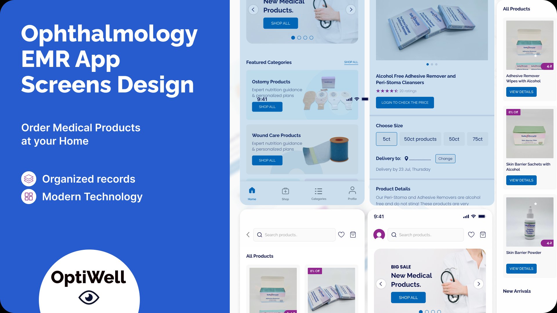
Multi-role interface
Four distinct user types - patients, pharmacists, wholesalers, retailers - each with different needs, permissions, and workflows within the same application.
Two parallel divisions
The patient-to-pharmacist flow and the wholesale-retail B2B flow had to coexist without creating confusion between the two very different use cases.
Medical context demands clarity
Eye care products and prescriptions require precise, unambiguous UI. Errors or confusion in a medical app erodes trust immediately and permanently.
Mobile-first usability
All four user types needed to navigate complex product catalogues, prescription uploads, and order management on small mobile screens.
Role-first entry, shared design language
The key decision was a role-selection screen at entry - patients and B2B users are routed into entirely separate flows from the moment they open the app, eliminating the risk of wrong-role confusion. Within each flow, the UI language stays consistent so the product feels unified rather than fragmented.
Role-based entry screen
Designed a clear role-selection screen (Wholesaler / Retailer / Patient) that routes users into their specific flow immediately, preventing cross-role confusion from the first tap.
Consistent visual language across roles
Despite different flows, all screens share the same component library - cards, navigation, typography, and colour - so the product feels like one coherent app regardless of which role you're using.
Medical-grade clarity in catalogue UI
Product listings show clear categorisation (Ostomy, Wound Care, etc.), ratings, pricing behind login for B2B, and size selectors - designed to reduce ordering errors.
Prescription upload flow
Designed a simple step-by-step prescription upload experience for patients - removing friction from what is typically an intimidating medical process.
The most important decision across all four roles was making role selection irreversible until a deliberate switch. Once a pharmacist logs in as a pharmacist, every menu, label, and action speaks to their job - not to a patient's. This reduces cognitive load significantly because users never encounter screens or options that don't apply to them.
The shared component library made this scalable. Rather than designing four separate apps, we designed four role contexts sitting on a single visual and functional foundation. Every card, button, and form followed the same spacing and interaction rules - making the experience feel like one coherent product even when the content and permissions were completely different.
Why it was built this way
The deliverables tell you what was built. These are the decisions that shaped why it was built that way.
Decision 1: Role selection is the first UX decision, not an afterthought. Most multi-user apps detect role through account settings or a dropdown buried in the UI. For Optiwell, role selection is the first screen - before any other interface is shown. In a medical context, showing a patient a wholesaler's pricing catalogue, even briefly, could create real confusion about what the app is for and whether they are in the right place.
Decision 2: One design system, four role contexts. The alternative would have been four separate visual experiences - different colours, different components, different spacing. That makes each role feel tailored but makes the product feel like four different apps. All roles in Optiwell share the same cards, typography, and interaction patterns. The differentiation is in content and permissions, not visual identity. This is what makes scaling to additional roles feasible without rebuilding the interface.
Decision 3: Medical catalogue UI prioritises precision over discovery. Product listings in a medical catalogue require a different hierarchy than a consumer e-commerce app. The first thing a pharmacist needs to see is category and product name - not recommendations or reviews. Every listing was designed to surface the information a professional needs to make a sourcing decision quickly, without scrolling or hunting.
Selected screens
Key screens from the Figma delivery - splash screen, welcome/role selection, and the product catalogue interface.
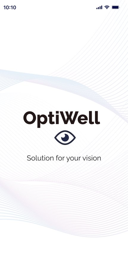
Splash screen
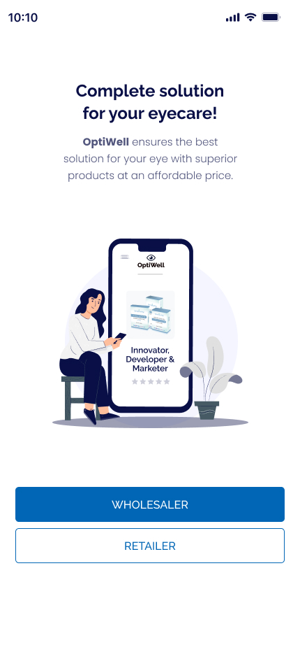
Role selection - welcome screen
What was delivered
"Quick service, trustworthy, and the product was better than expected. Highly satisfied with the outcome."
- Client, Optiwell · Upwork · ★★★★★ 5.0