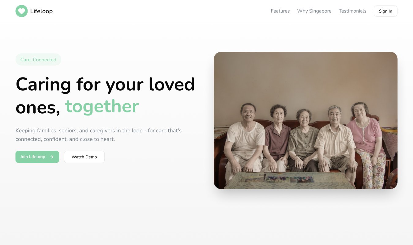
What is LifeLoop?
Singapore has one of the fastest-ageing populations in Asia. LifeLoop was built to address a real gap - families with elderly parents struggle to coordinate care across multiple people without a central system. The platform brings families, professional caregivers, and the elders themselves into a single connected experience.
Family members can track their elder's daily activities, manage caregivers, and set up emergency contacts. Caregivers log care activities, receive reminders, and communicate with families. Elders get a simplified view of their own schedule and can trigger SOS alerts if needed. The client came with rough sketches and a clear vision - my job was to make it real.
Four roles, one product - with elders as primary users
The most demanding design constraint was accessibility. Elders needed to use this product independently - which meant typography, touch targets, contrast, and navigation all had to meet a higher bar than a typical web app. At the same time, the family dashboard needed data density and power-user features.
The root tension: a 35-year-old family member managing care from a web dashboard and a 75-year-old using the same platform to check their daily schedule are not just different users - they have opposite requirements for what good UI looks like. Data density that helps a family member scan quickly is precisely the visual complexity that makes an elder's screen unnavigable. The design had to be genuinely different for each role, not just cosmetically different.
Family members
Track elder activity, manage assigned caregivers, view health metrics, receive alerts, and manage the entire care circle from a central dashboard.
Caregivers
Log care activities, receive task reminders, communicate with families, and maintain detailed care records for each elder assigned to them.
Elders
Simplified, accessible view of their daily routine. Large text, clear navigation, and one-tap SOS call setup for emergency situations.
SOS system
An emergency alert flow that families pre-configure so elders can trigger help without needing to navigate complex menus under stress.
From rough sketches to a complete design system
The client had concept sketches but no visual direction. My process started with understanding each role's core job - not their full feature list - and designing the most critical flows for each before building out the secondary screens.
Role mapping & user flow architecture
Mapped all four user journeys end-to-end, identified where roles intersect (e.g. caregiver logs → family sees), and defined the navigation structure before touching any UI.
Accessibility-first design decisions
Set minimum 16px body text, high contrast ratios for elder-facing screens, large tap targets (minimum 48px), and simplified navigation with clear iconography for the elder interface.
Dashboard for family members
Designed a care circle dashboard showing real-time elder status, health metrics (heart rate, BP, steps), today's tasks, and recent alerts - all scannable at a glance.
SOS flow design
Built a pre-configured SOS system that families set up once - elders can trigger an alert with a single tap without navigating menus, critical for high-stress emergency moments.
Iterative design over 8 weeks
Weekly review cycles with the client resulted in significant back-and-forth refinement - the 8-week timeline reflects a thorough, collaborative process rather than slow delivery.
Designing for elders is more demanding than designing for any other user type because the margin for confusion is close to zero. If a 75-year-old cannot immediately understand what a screen is asking them to do, they will not try a second time. Every interaction was tested against one question: could someone unfamiliar with smartphones complete this without help?
The 8-week timeline reflected something the client understood from the start: this kind of product cannot be rushed. Getting family members, caregivers, and elders to trust a digital platform for something as important as daily care requires every detail - the size of a button, the clarity of an alert, the tone of an error message - to work correctly the first time.
Why it was built this way
The deliverables tell you what was built. These are the decisions that shaped why it was built that way.
Decision 1: Accessibility constraints came first, not as a final pass. In most projects, accessibility is applied after the core UI is built. For LifeLoop, it was set as a baseline before any screens were designed. Minimum 16px body text, 48px tap targets, and high contrast ratios were defined at the start - every elder-facing element was checked against those baselines throughout the process, not reviewed at the end.
Decision 2: The SOS flow had to work with zero cognitive load. Designing an emergency alert for elders means designing for worst-case conditions: stress, physical difficulty, potential disorientation. A two-step SOS is not acceptable if either step requires reading a label under pressure. The pre-configured SOS system - set up once by the family member - means the elder never makes a decision when triggering an alert. One tap, pre-set contacts, immediate notification.
Decision 3: Eight weeks was the right timeline, not a slow one. Simplified interfaces often take more iterations than complex ones. Removing friction without removing functionality is harder than adding features. The weekly review cycles with the client over 8 weeks reflect what this kind of product genuinely requires - and the Before/After section shows how much changed between the starting sketches and final delivery.
Selected screens
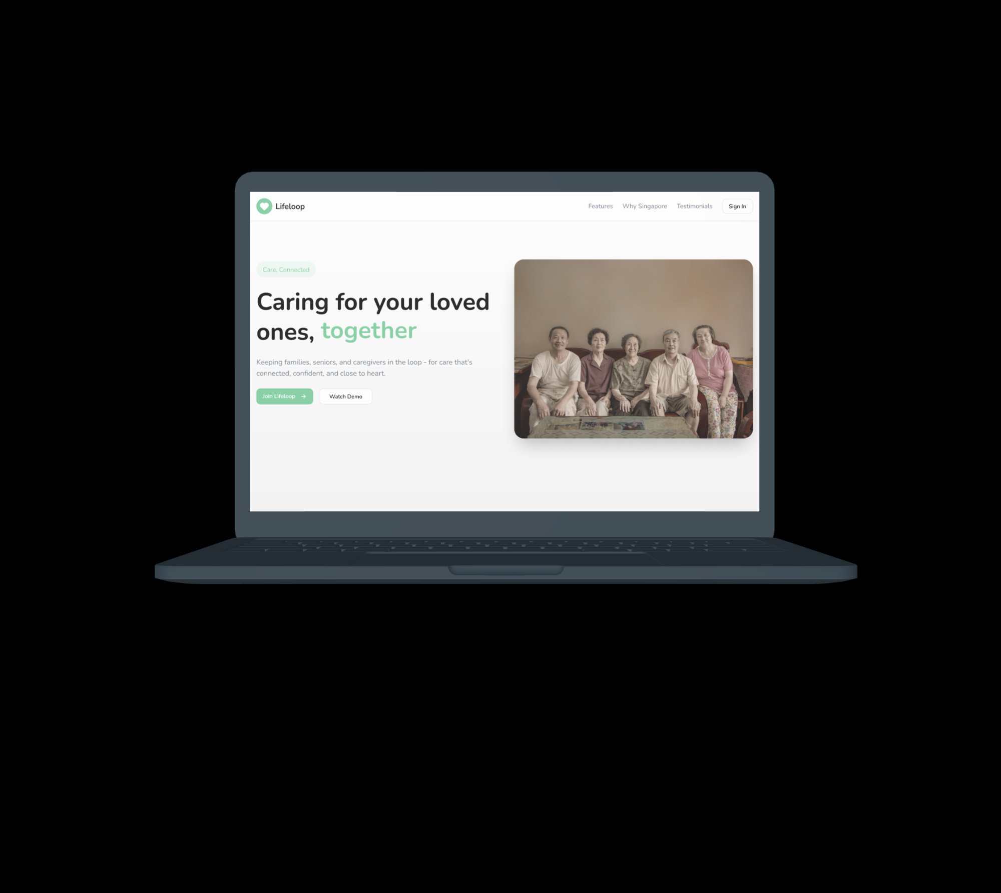
Marketing homepage - device mockup
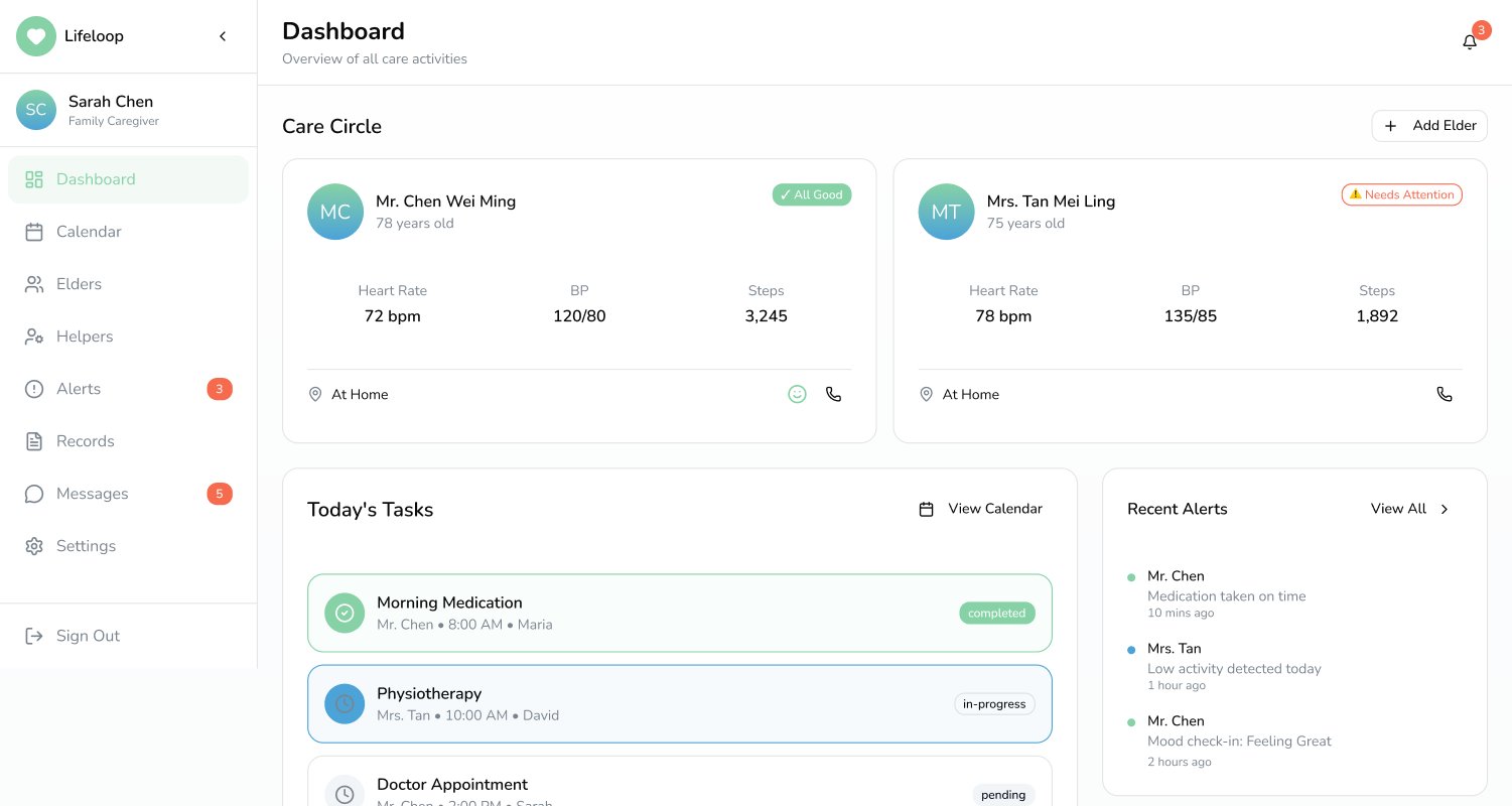
Family / caregiver dashboard