← Back to Thinking

Why Nobody Uses Your SaaS AI Features (It's a UX Problem)

A split-panel UI mockup comparing a black-box AI suggestion feature with no transparency versus a trusted AI feature showing confidence scores, ICP match explanation, and an override option

Teams are shipping AI features at a rate the industry hasn't seen before. Prospect scoring. Smart replies. Automated summaries. Predictive prioritisation. The technology is genuinely impressive.

And then nobody uses it.

Research consistently shows that the majority of AI features in SaaS products see fewer than one in four users engaging with them regularly - not because the models fail, but because the experience around the model gives users no reason to trust it. The AI works. The UX doesn't.


The Gap Is Not About Capability

When teams investigate low AI adoption, the first instinct is to look at the model. Is the accuracy high enough? Are the suggestions relevant? Should we retrain on more data?

These are reasonable questions - but they're almost never where the problem lives. Users don't abandon AI features because they fire a wrong suggestion occasionally. Users abandon AI features because they have no way to judge whether a suggestion is right or wrong. When you can't evaluate a recommendation, the rational move is to ignore it.

This is the adoption gap: a distance between what the AI can do and what users feel safe acting on. It's a design problem, and it has three root causes that appear in almost every low-adoption AI feature I've reviewed.


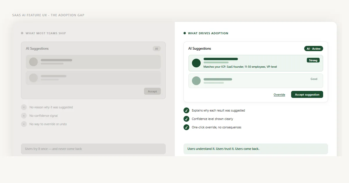
Three UX Failures That Kill AI Adoption

1. Black-box suggestions with no reasoning

A suggestion appears. There is a name, a score, a button. No explanation of why this was surfaced. No criteria you can inspect. No signal that distinguishes a strong match from a weak one. The user is being asked to act on pure output with no access to input.

This feels fine in a product demo. In daily use, it trains users to distrust every suggestion - because once one recommendation turns out to be wrong and there's no way to understand why, the whole system becomes suspect. Teams spend months improving model accuracy and see no lift in adoption because the problem was never the accuracy. It was the opacity.

2. All suggestions look equally confident

A strong signal and a weak signal are displayed the same way. Same card. Same layout. Same button. No differentiation. So users either apply the same scepticism to everything - ignoring the good suggestions along with the weak ones - or they accept everything uncritically, which leads to bad outcomes that erode trust even faster.

Confidence is information. When you hide it, you're asking users to do work the model has already done. Surfacing confidence levels - clearly, in plain language - lets users allocate their attention where it matters. A list of AI suggestions where "Strong match" items are visually distinct from "Worth reviewing" items is a tool. A flat list of identical cards is noise.

3. Override feels risky or permanent

Even when users distrust a suggestion, many accept it anyway - because declining feels uncertain. Will it affect their account? Will the AI stop learning from them? Will this dismiss a future recommendation too? When the cost of disagreeing with the AI is unclear, users default to compliance, not because they think the AI is right but because the alternative feels unpredictable.

This is the most underestimated failure mode in AI UX. Users don't need to agree with every suggestion. They need to know that disagreeing is safe, easy, and consequence-free. The absence of a clear override path doesn't just frustrate users - it traps them.

Your AI feature probably works. Your users just don't trust it yet - and that's a design problem.

Same AI, same data. One gives users nothing to evaluate. The other gives them a reason, a confidence level, and a safe exit. Only one gets used.

What Actually Drives AI Feature Adoption

The fix is not a better model. It's a better contract between the AI and the user - one that makes three things visible: why this suggestion was made, how confident the system is, and what happens if the user disagrees. Get these three right and adoption follows. Ignore them and no amount of accuracy improvement will move the number.

Show the reasoning in one sentence

Don't expose model internals. Don't show a probability score. Show a single human-readable sentence that tells the user which signal drove this recommendation. "Matches your ICP: SaaS founder, 11–50 employees, VP-level." "Re-engaged with your content three times this week." "Similar profile to your last five closed deals." That sentence does more for trust than any accuracy benchmark you can cite in a product tour. It lets users confirm the AI's logic against their own - and when they agree with the reasoning, they act on the suggestion faster and with more confidence.

Signal confidence in plain language

Convert model confidence into words, not numbers. "Strong", "Good", "Worth reviewing" - three tiers, each with a distinct visual treatment. A raw percentage like 87% tells most users nothing. A label tells them exactly how much attention to give this item. Place the confidence indicator close to the suggestion, not in a tooltip. Users should be able to scan a full list and instantly know which suggestions are ready to act on and which ones need a second look. That scanability is what makes an AI feature feel useful rather than noisy.

Make override frictionless and consequence-free

One click. No confirmation dialog. No penalty message. No "are you sure?" Users need to know they can disagree with the AI without anything bad happening to their account, their history, or future recommendations. The override should be a quiet, inline action - a link or small button that sits alongside the accept option without competing for attention. When overriding is easy, something counterintuitive happens: users engage with AI features more, not less. They stop treating the AI as an authority and start treating it as a collaborator - and collaborators get used.

A confirmation modal signals consequence. An inline link signals control. One teaches users to avoid the override. The other makes them comfortable using it.


What This Looks Like in Practice

When I worked on the dashboard redesign for Linkyfy.ai - an AI-powered LinkedIn prospecting platform - AI adoption was the core problem. The platform's AI had been generating prospect suggestions for months. Usage data showed that fewer than one in five users ever acted on them.

The suggestions weren't wrong. But every card looked identical: a name, a role, and an Accept button. No reason why. No confidence signal. No way to dismiss without it feeling like a permanent decision. Users described the feature as "random" and "hard to trust" - not because they'd tested it and found it lacking, but because they had no basis on which to evaluate it at all.

The redesign added three things: a one-sentence reason for each suggestion, a confidence tier displayed as a plain-language label, and an inline Override link that required no confirmation. The AI didn't change. The adoption did.

This pattern shows up across every AI feature I've reviewed. The same gap that kills SaaS onboarding also kills AI adoption - users encountering a system they can't read, with no clear signal of what to do next and no safe way to step back. Transparency fixes both. Build an AI experience where users understand what they're being shown, trust the signal they're seeing, and feel confident they can correct it - and the feature gets used.

Frequently Asked Questions

SaaS AI features go unused primarily because users don't trust what they can't evaluate. When a feature surfaces a suggestion with no reasoning, no confidence signal, and no easy way to override it, users feel like they are handing control to a black box. They try it once and don't come back. The AI may be working perfectly - but if the UX doesn't make that legible, adoption stays low.

The most reliable way to increase AI feature adoption is to design for trust, not just capability. Show users why a suggestion was made - the specific criteria or signals the AI used. Add a confidence level so users can distinguish a strong signal from a weak one. And make it effortless to override or undo any AI action. Users adopt AI features when they feel informed and in control, not when the AI is hidden behind a single button.

Users don't trust AI recommendations when they have no way to evaluate them. If a suggestion appears with no context - no explanation of why it was made, no indicator of how confident the model is, no way to reverse the action - users are being asked to act on pure faith. For decisions that affect their workflow, their data, or their team, that's too much to ask. Trust is built by showing your reasoning, not just your output.

Good AI feature UX makes three things visible: why the AI made this suggestion, how confident it is, and what happens if the user disagrees. The reasoning should be one short sentence - specific and human-readable, not technical jargon. The confidence level should be a clear label like Strong, Good, or Uncertain - not a raw percentage. And the override option should be a single click with no confirmation dialog and no penalty. When these three elements are in place, users engage with AI features rather than ignoring them.

Translate model confidence into plain language rather than numbers. A raw percentage like 87% means very little to most users - but a label like Strong match or Low confidence is immediately actionable. Use three or four tiers at most, each with a distinct visual treatment: colour, weight, or icon. Place the confidence indicator close to the suggestion itself, not tucked away in a tooltip. Users should be able to scan a list of AI suggestions and instantly know which ones deserve immediate action and which ones need a closer look.

Usage is a user interacting with an AI feature at least once. Adoption is a user building that feature into their regular workflow. Low adoption often looks like healthy usage at launch followed by a sharp drop-off. Users explore the feature, find they can't evaluate or trust its output, and revert to doing the task manually. Adoption requires that the AI earns trust over repeated interactions - which only happens when each interaction is legible, reversible, and genuinely useful.

Let's talk

Is your AI feature sitting unused in your product?

If users aren't engaging with your AI features, the model is rarely the issue. It's almost always the UX around it - the transparency, the confidence signals, the sense of control. I'd be happy to take a look.

Connect on LinkedIn →

or explore my services to see how I work