40 to 60 percent of users who sign up for a SaaS product never return after their first session.
Most product teams respond to that number the same way: optimise the onboarding flow. Better tooltips. A cleaner product tour. A progress bar. A shorter welcome sequence.
It rarely works - not because these things don't matter, but because they're solving for the wrong goal entirely.
The Problem With Designing for the Aha Moment
The idea isn't wrong at its core. Users do need to experience value early. But when teams build their entire onboarding around delivering one choreographed peak moment - the instant the product finally clicks - three quiet failures follow.
It turns onboarding into an event, not a system. You design the sequence, the user completes the sequence, and then what? Real retention isn't built on one moment. It's built on a series of small value confirmations that compound over days and weeks. Onboarding that ends at "aha" leaves users stranded right after it.
It assumes one path works for everyone. A marketing manager and a data analyst signing up for the same analytics platform have completely different definitions of value. One prescribed journey guarantees most users are on the wrong path.
It leads teams to build for demo confidence, not daily use. The choreography looks great in a sales walkthrough. Then real users arrive - some on mobile, some who skipped the welcome email, some who don't know what "workspace" means yet - and the sequence falls apart.
3 SaaS Onboarding Mistakes That Kill Activation
1. Education Before Action
The most common mistake is making users learn before they do anything. Feature walkthroughs, explainer videos, setup checklists that must be completed before the real product appears. Users don't want to learn your product. They want to solve their problem. The fastest path to activation is letting them touch something real in the first 60 seconds - and surfacing guidance in the moment it's needed, not before it.
Consider two versions of the same signup moment. Version A: the user creates an account, lands on a five-step welcome sequence explaining what each feature does, and must work through a checklist before the real product appears. Version B: the user creates an account, lands directly in the product with one clear prompt - "Create your first campaign" - and the rest of the interface waits. Version A produces a user who knows more about the product before they touch it. Version B produces a user who has already done something inside it. The second user activates at a higher rate - not because they were more motivated, but because the product got out of their way.
2. One Path for Nobody
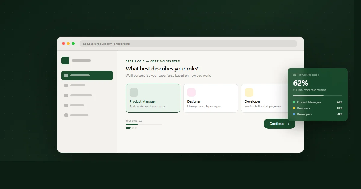
When your onboarding can't tell who it's talking to, it's designed for nobody in particular. A 30-second role question at signup isn't friction - it's personalisation. It lets you route a marketing manager toward campaign data and an engineer toward the API, immediately. The users who activate fastest are almost always the ones who reached their specific first value fastest. Role-based routing is one of the highest-leverage changes a SaaS team can make to activation rates.
I saw this directly in the LifeLoop platform - a family care coordination product built for Singapore's elderly care sector, with four distinct user types: elderly residents, family members, care staff, and facility administrators. Each role had a completely different definition of first value. A resident needed to see their daily schedule. A family member needed activity updates for their parent. A care staff member needed task assignments. An administrator needed compliance status. A single onboarding flow designed for "the user" would have arrived at the wrong place for all four of them. The solution was a role screen at first login that routed each user to their specific starting view. The onboarding didn't get longer. It got relevant.
3. Empty State as Default
A new user who logs in to blank charts, placeholder lines, and "You haven't added anything yet" prompts doesn't think I need to populate this. They think something is broken or I don't understand this product. The empty state is not a neutral blank canvas. It's an active experience - and for most SaaS products, it's their coldest and most avoidable first impression. I've written about why SaaS empty states lose users before they begin and what the design actually needs to do.