← Back to Thinking

How to Run a UX Audit on Your SaaS (And What to Fix First)

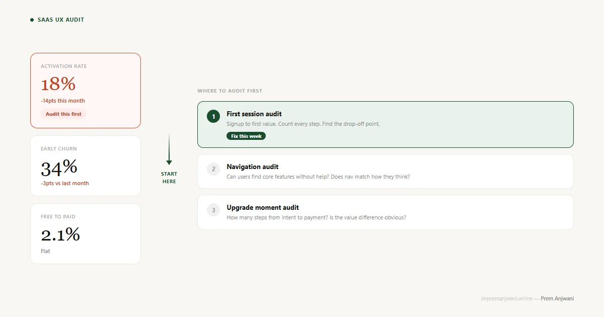
A UX audit framework diagram showing three metric cards - activation rate at 18% highlighted as critical - connected by an arrow to three prioritised audit zones: first session, navigation, and upgrade moment

It is 11pm. Your activation rate dropped to 18% this month. Your co-founder is asking questions. You open your product and start clicking around, trying to feel what your users feel. An hour later, you have a list of 40 things that look wrong. You do not know where to start.

This is the most common way founders run UX audits. It is also the least useful.

A UX audit is not about finding everything that is wrong. It is about finding what is actually killing your numbers - and doing those things first. Here is how to do that.


What a UX Audit Actually Is

A UX audit is a structured review of your product's user experience to identify where it is creating friction, confusion, or drop-off. You are looking for the gap between what users are supposed to do and what they actually do.

The word "audit" makes it sound lengthy and expensive. It can be. But at its core, a UX audit is a disciplined way of answering one question: where is my product getting in the way of my users?

Done right, it takes two to five days depending on the size of your product. Done wrong, it becomes a 100-point checklist that nobody acts on.


Why Most UX Audits Fail Founders

Most UX audit guides give you a checklist. Onboarding - check. Navigation - check. Forms - check. Accessibility - check. A hundred items later, you have a spreadsheet full of issues and no idea which ones are connected to your metrics.

The problem is the order. If your activation rate is 18%, the issue is almost certainly in the first session - not in your settings page accessibility. Auditing everything equally is how you spend two weeks fixing the wrong things.

The framework below starts with the metric, not the checklist.


Step 1: Follow the Metric

Before you open your product, look at your data. Your metrics are pointing at the problem. You just need to know how to read them.

Activation rate is low (under 25%)

Users are not reaching their first moment of value. Audit the first session - from signup to the first meaningful action. This is your highest-priority area and where almost every low-activation product has its biggest leak.

Early churn is high (leaving in months 1-3)

Users activated but something pushed them out. Audit navigation, feature discoverability, and the experience of returning after day 1. They found value once - they just could not find it again.

Free-to-paid conversion is low (under 3%)

Users like your product but are not upgrading. Audit the upgrade moment - what happens when they hit a paywall, how pricing is presented from inside the product, and how much friction sits between "I want this" and "I have paid for it."

Support tickets are high around specific features

Users want to use those features but cannot figure them out. Audit the information architecture and in-product guidance around those specific areas. Your support inbox is a UX audit report waiting to be read.

You do not audit all four at once. Pick the metric that is bleeding most and start there. For our 11pm founder with 18% activation - the first session is everything.

Step 2: Audit the First Session

Sit down and go through your product as a new user. Not a power user who knows where everything is. Someone who signed up 10 minutes ago and has no context.

What is the first screen?

What does the user see immediately after signup? Is it an empty dashboard with no direction? A wall of features they do not understand yet? Or one clear action that moves them toward value? Empty dashboards are the single most common activation killer I see in SaaS products.

When I worked on the Linkyfy.ai dashboard redesign, the product opened to a blank state with six navigation options and no indication of what to do first. Fewer than one in five users took any action in the first session. After redesigning the first screen around a single guided action - setting up their first campaign - that number improved significantly within two weeks. The AI did not change. The first screen did.

How many steps to first value?

Count every click, input, and decision between signup and the moment the user gets something real from your product. Every step is a potential drop-off point. Industry benchmark: under five steps for simple products, under ten for complex ones. If you have more, you have found your problem. This is the same activation failure I covered in depth in why SaaS onboarding fails - most products put too much between the user and their first win.

What does the empty state look like?

For any screen that starts blank - the dashboard, the contacts list, the project board - what does the user see? A blank screen is a missed opportunity. It should tell the user what belongs there and give them one clear action to fill it. An empty state is not a design detail. It is the last onboarding moment before a user decides to come back or never return.

What happens when they make a mistake?

New users will click the wrong thing, skip a required field, or miss a step. What does your product do? Does it give a clear, helpful error message? Or does it fail silently and leave them stuck? Silent failures are invisible in analytics - you only see the drop-off, not the cause.

The biggest drop rarely happens at signup. It happens at the empty dashboard - where users arrive and have no idea what to do next. That is where the audit starts.

Step 3: Audit Navigation

If users are activating but leaving in the first one to three months, they likely found value once and could not find it again. Navigation is where this almost always breaks down. The problem is rarely that features are missing. It is that users cannot locate the features that are already there.

Can a new user find your core features without help?

Open your product and try to complete the three most common user tasks without using search or help docs. How many clicks does each take? Where do you get stuck? If you get stuck, your users are getting stuck - and unlike you, they are not motivated to push through.

Does your navigation match how users think?

Most SaaS products are structured around how the engineering team built them, not how users think about their workflow. A user does not think "I need to go to Contacts, then Filter, then Export." They think "I need to get this list out." If your navigation reflects your database structure instead of your user's mental model, you have an information architecture problem. I wrote specifically about this pattern in why SaaS dashboards fail - the structure of what you show matters as much as what you show.

What are users asking about in support?

Pull your last 30 support tickets. What features or tasks come up most? These are navigation failures. If users are emailing to ask where something is, the product failed them - not the other way around. Your support inbox is a free UX audit that most teams never read.


Step 4: Audit the Upgrade Moment

The upgrade moment is when a user on a free plan hits the ceiling and decides whether to pay. Most SaaS products design this moment as an afterthought. It shows in the conversion numbers.

What happens when a user hits a paywall?

Do they see a clear explanation of what upgrading gives them? Or does the feature just disappear with a generic "Upgrade to Pro" message and nothing else? The design of this moment directly affects whether intent converts to revenue.

How many steps from intent to payment?

Every additional step between "I want this" and "I have paid" is a leak. If a user has to click five times to reach the pricing page from inside the product, you are losing buyers who were ready to buy. Map the upgrade path and count the steps. Three or fewer is the target.

Is the value difference immediately obvious?

When a user compares Free vs Pro, can they instantly see what changes for them personally? Or do they have to read a comparison table of 20 features to work out whether the upgrade is worth it? This is a design problem, not a pricing problem. Clarity at the decision moment is a UX responsibility.


What to Fix First

After your audit, you will have a list. Here is how to order it so you are working on what matters, not just what is visible.

Two weeks of focused work on the right three problems will move your metrics more than six months of scattered improvements.


The Scenario, Resolved

Back to our 11pm founder. Activation rate at 18%. Two weeks to make progress.

Week 1: Audit the first session. Map every step from signup to first value. Find where users are dropping - you will almost always find it within the first three steps. Redesign or simplify that one moment. Not ten things. One.

Week 2: Measure. See where users are now dropping off. Fix the next bottleneck in the same flow.

Two weeks later, you are not done. But you know exactly what is broken and what the priority order is. That is what the audit is actually for - not a complete fix, but a clear direction when everything feels wrong at once.

The 11pm audit spiral is a symptom, not a process. When every problem looks equally broken, you need a framework that tells you where to look first - not a longer list.

Frequently Asked Questions

Run a UX audit when a key metric drops without an obvious explanation, before a fundraise, after shipping a major update, or every six months as a proactive check. Do not wait until churn is already high - the earlier you catch UX friction, the cheaper it is to fix.

A proper SaaS UX audit reviews the onboarding flow, navigation structure, key user workflows, empty states, error handling, and the upgrade moment. It combines analytics data with hands-on product review. The goal is not a checklist - it is a prioritised list of what to fix first.

For a focused audit on one critical flow, two to five days is realistic. A full product audit covering all major user journeys takes one to two weeks. The scope depends entirely on what your metrics are telling you to focus on first.

Yes, but with limitations. Founders can spot many obvious problems by walking through the product as a new user and reviewing analytics drop-off points. A designer catches subtler issues - information hierarchy failures, visual clarity problems, and pattern inconsistencies that are harder to see without trained eyes.

A freelance designer typically charges $1,500 to $5,000 for a focused audit, and $5,000 to $15,000 for a full product audit. The ROI is measurable - fixing the right activation or conversion issue usually pays back the audit cost within one to two months of improved metrics.

Prioritise by where the fix sits in your critical user flow. Issues between signup and first value - or between free and paid - come first. Navigation and feature discoverability problems come second. Visual polish and edge cases come last.

Let's talk

Your SaaS has a UX problem. Find it before your users do.

If a metric is dropping and you are not sure where to look, a second set of eyes makes the difference. I have run UX audits on SaaS dashboards and onboarding flows and know where to find what is actually costing you.

Connect on LinkedIn →

or explore my services to see how I work