← Back to Thinking

How Airbnb Found the UX Problem Nobody Was Looking For

Split-panel illustration comparing a dark listing card with a blurry camera phone photo and ghosted Book Now button on the left, versus a clean listing card with a professional room illustration and active Book Now button on the right, with a stat bar showing 2-3x more bookings and doubled New York revenue

In 2009, Airbnb had a real demand problem - but not the kind you would expect. There was demand. Hosts in New York had listed their apartments. Guests were searching. The product was live and functional. But bookings were not happening, and the founders could not explain why from Mountain View.

The problem was not in the app. It was not in the pricing. It was not in the onboarding flow or the booking interface. It was somewhere the team had not thought to look - and finding it required getting on a plane.


The Advice That Sent Them to New York

Shortly after joining Y Combinator in 2009, Brian Chesky and Joe Gebbia sat down with Paul Graham for their first office hours. Graham looked at their numbers and asked a blunt question: their users were in New York - why were the founders still in Mountain View?

His advice was direct: go meet your users in person. Get to know them one by one. Chesky's first instinct was to push back - "But that won't scale." Graham's reply was to do it anyway. That exchange later became the foundation of Graham's widely-read essay on doing things that don't scale - one of the most practical pieces of startup advice ever written.

So the founders booked flights to New York.


What They Found When They Showed Up

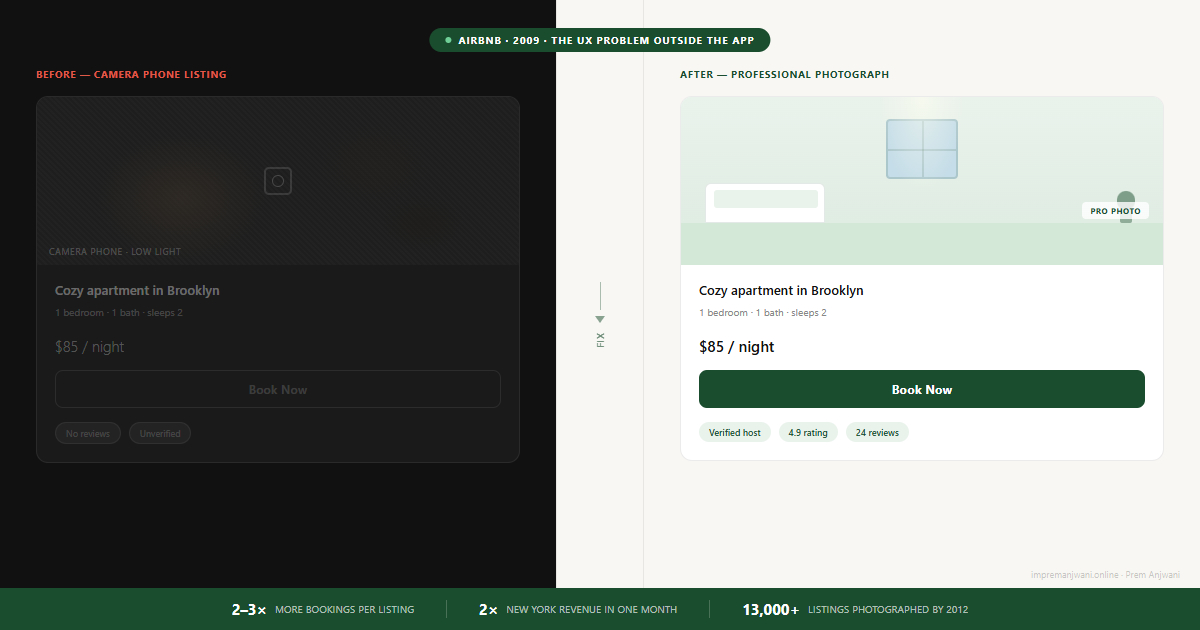
They did not just talk to guests. They booked stays with 24 hosts across New York and experienced the listings the same way a guest would. The problem revealed itself the moment they looked at the listings properly.

The photos were terrible. Camera phone shots taken in dim lighting. Blurry angles that gave no sense of space. Images that looked like they had been lifted from a 2007 Craigslist post. The apartments themselves were often perfectly fine - decent, bookable spaces that guests would genuinely enjoy. But no one looking at those photos could tell that. The visual evidence said: do not trust this.

The interface was not the problem. The booking flow was not the problem. The content the interface depended on was the problem - and the design had no way to fix that on its own.


The Fix Nobody Expected

The founders did not schedule a design sprint. They did not A/B test a new layout or audit the booking funnel. They rented a DSLR camera and started knocking on doors in Manhattan and Brooklyn, replacing bad phone shots with proper photographs of as many listings as they could reach.

This was not scalable. It was two people with a camera, one apartment at a time. But it worked immediately.

Listings with the new photos received 2 to 3 times more bookings than identical listings with the original photos. By the end of that month, Airbnb's New York revenue had doubled. Same city, same listings, same prices - different photos.

The drop-off was not at the booking button. It was at the photo - several steps earlier. The design was not the problem. What the design was showing was the problem.

Scaling What Worked

The founders then asked the harder question: if this is the problem in New York, where else is it the problem?

The answer was everywhere. London, Paris, Vancouver, Miami - the same low-quality photos, the same trust barrier, the same stalled bookings. What had been an experiment in one city was actually the explanation for why growth was stalling globally.

In the summer of 2010, Airbnb launched the Pro Photo Program - a service that let hosts schedule a professional photographer directly through the platform, free of charge. They started with 20 freelance photographers. By February 2012, the program had grown to nearly 5,000 shoots per month. By mid-2012, over 2,000 photographers had covered more than 13,000 listings across 5,000 cities on six continents.

Listings with professional photography were 2.5 times more likely to be booked. The rented camera had turned into a global program that changed how the entire platform competed.

The same insight that doubled revenue in New York in one month scaled to a program covering six continents in three years. The manual, unscalable fix was always the proof of concept.

What This Means for Product Design

Most product teams, when conversion drops, look at the interface first. They run heatmaps, review session recordings, A/B test button labels. Sometimes that is exactly right. But Airbnb's story describes a different category of UX problem - one that lives outside the interface entirely, in the content, the context, or the trust signals that the design depends on but cannot create on its own.

A guest on Airbnb in 2009 was not confused by the booking flow. The steps were clear. What stopped them was something the interface had no power to fix: they could not trust what they were about to pay for. The design was serving content that was not good enough to earn a decision.

This pattern shows up in products beyond marketplaces. A SaaS trial that shows an empty dashboard to a new user is asking them to trust a product with nothing to look at. The same trust gap that stalls Airbnb bookings stalls SaaS activation - when users cannot see value quickly, they leave before the design ever gets a chance to convert them.

The diagnostic question most teams skip is not "what should we redesign?" It is "where is the user losing confidence in us?" Those two questions lead to different places. The first sends you back to Figma. The second sometimes sends you to New York with a camera.

The most expensive UX problem is the one you are not looking for. Airbnb's interface was fine. The booking flow worked. The friction lived in the trust gap between what guests saw and what they needed to believe before spending money. If you want to find the equivalent in your own product, a structured UX audit starts by tracing the moment users lose confidence - not just where they leave.

Common questions

Airbnb discovered that low-quality listing photos were preventing guests from trusting the properties enough to book - even when the spaces themselves were good. Camera phone shots in poor lighting gave guests no visual evidence the space was worth paying for. By replacing those photos with professional photographs, Airbnb removed the trust barrier that was stalling conversions. Listings with professional photos received 2 to 3 times more bookings, and New York revenue doubled within a month.
One of Airbnb's most significant early growth moves was a deliberately manual, unscalable fix. In 2009, after Y Combinator co-founder Paul Graham told them to go meet their users in person, the founders flew to New York, booked stays with 24 hosts, and found that listing photos were the core problem. They rented a DSLR camera and went door to door photographing apartments. That month, New York revenue doubled. The insight led directly to the Airbnb Pro Photo Program, launched in summer 2010, which scaled to over 2,000 photographers across 5,000 cities by 2012.
Go where your users lose confidence, not just where they exit. Trace the decision moment just before a drop-off and ask what information the user is working with at that exact point. Airbnb's drop-off was not at the booking button - it was at the listing photo, several steps earlier. Most analytics tools show where users exit. Fewer reveal why the content they saw before that moment was not convincing enough. Getting closer to users directly - through sessions, interviews, or the founders literally showing up - often reveals what no dashboard can.
The Airbnb Pro Photo Program was launched in summer 2010 after the founders manually tested professional photography in New York and saw a 2-3x booking increase on photographed listings. The program let hosts schedule a free professional photographer through the platform. It started with 20 freelance photographers and grew to over 2,000 photographers covering 13,000 listings across 5,000 cities on six continents by mid-2012. Listings with professional photos were 2.5 times more likely to be booked.
Yes - and Airbnb's story shows why the lesson is broader than just photos. A well-designed interface presenting untrustworthy content still fails to convert. The visual quality of what your product shows - not just how it is designed to show it - directly affects whether users take action. This applies to any product where users make a trust-based decision before committing: marketplaces, SaaS trials, onboarding flows, portfolio sites. Design the container and the content with equal care.
Work with Prem

Is your product losing users before they reach the decision point?

I work with product teams to find where users are losing confidence - whether that is in the interface, the onboarding, or somewhere else entirely. If your conversion or activation numbers are not adding up, I can help trace where the trust gap actually lives.

Let's talk on LinkedIn ↗