← Back to Thinking

Why SaaS Dashboards Fail Their Users - And How to Actually Fix Them

A SaaS analytics dashboard on a laptop screen, representing the UX challenges of data-heavy product interfaces

You built a solid SaaS product. The features work. The data is accurate. The backend does exactly what it promises.

But users keep dropping off. Support tickets come in with the same complaint: "I don't know where to go." Trials don't convert. Power users are the only ones who truly get it - and even they took weeks to figure things out.

Here's the uncomfortable truth: the problem usually isn't your product. It's your dashboard.

Most SaaS dashboards are designed to show everything, not to help anyone. And that difference costs companies far more than they realise - in churn, in support costs, and in the gap between the product they built and the one users actually experience.


The Real Reason SaaS Dashboards Fail

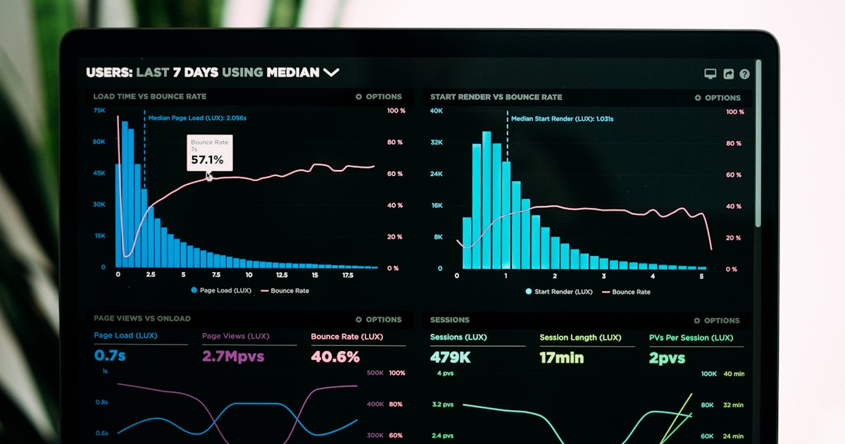
Dashboards often get designed to impress during a demo - clean charts, comprehensive data, a full view of everything the product can do. It looks powerful. It feels complete. It sells well.

Then actual users show up on day two, log in, and freeze.

The problem is that demo-ready and daily-use-ready are two completely different design targets. Real users don't want everything visible at once. They log in with a specific goal: check campaign performance, review yesterday's numbers, pick up where they left off. When they're met with a wall of information and no clear next step, cognitive overload kicks in fast.

A confused user doesn't explore. They leave. And once they've left, your product never gets a chance to prove its value.

4 SaaS Dashboard UX Mistakes That Silently Drive Users Away

1. No Visual Hierarchy

When every element on a dashboard carries equal visual weight - same font size, same card size, same prominence - users can't tell what matters most. Their eyes don't know where to go, so they go nowhere.

Strong SaaS dashboard design uses hierarchy deliberately. The one metric your core user came to check should be the most prominent element on screen. Supporting data sits below it. Secondary details live in collapsed sections or deeper views.

If everything is important, nothing is. The right layout makes the primary metric unmissable - everything else plays a supporting role.

2. Data Without Context

Raw numbers are almost meaningless on their own. "1,243 active users" - is that good? Is it down from last week? Should you be worried or celebrating?

Dashboards that display data without context force users to do mental arithmetic every time they log in. That is exhausting. The fix is simple: pair every key metric with a trend indicator, a period comparison, or a clear status signal - on track, needs attention, critical.

A number on its own is data. A number with a trend is insight. Give users the second one.

3. Ignoring the First Session Entirely

Most dashboards are designed for experienced, returning users. But every user starts as a first-timer - and that first session is where you either earn their trust or lose them permanently.

When someone logs in for the first time and sees empty charts, blank states, and no guidance, they don't think "I need to add data." They think "something is broken" or "I don't understand this product."

Onboarding and dashboard UX are not separate problems. The first session must guide users toward their first meaningful moment - the instant the product clicks for them. Until they reach that moment, you are quietly losing them.

4. Flat Information Architecture

When everything lives at the same level - the overview, detailed reports, settings, usage stats - there is no sense of start here, then go deeper. Users feel overwhelmed because they are. Everything is equally accessible and equally visible, which means there is no natural path through the product.

Good SaaS UX design layers information intentionally. The dashboard is the surface - a clean summary of what's happening right now. Deeper data is always available, but it doesn't crowd the primary view. This keeps the default experience simple while preserving the depth that power users need.


How to Fix Your SaaS Dashboard UX

The good news: you rarely need to rebuild from scratch. Most dashboard UX problems have focused, actionable solutions.

Start with one honest question: What does your user need to know in the first ten seconds of logging in? Build the dashboard around that single answer. Everything else is secondary.

Watch a new user navigate it. Not a colleague who helped build it - someone who has never seen it before. Notice every pause, every wrong click, every moment of hesitation. Those are your problem spots, and they are often not where you expect them to be.

Establish hierarchy around your three most important metrics. Make them unmissable. Give everything else a supporting role.

Add context to every key number. Trend arrows, percentage changes, colour-coded signals - small additions that transform numbers from raw data into instant insight.

Design the first session as a separate experience. An empty state that guides rather than confuses. A short checklist. A progress prompt. Something that shows new users the fastest path to their first win inside your product.

None of these are massive changes. But the cumulative impact on user experience - and on retention - is significant.


What This Looks Like in Practice

When I redesigned the dashboard for Linkyfy.ai - an AI-powered LinkedIn prospecting platform - the core problem was exactly this: too much shown, too little communicated.

Users landed on a screen full of data with no clear sense of what to do next. The visual hierarchy was flat. Metrics had no context. The onboarding experience ended right before the dashboard began, dropping users into the deep end with no guidance.

The redesign concentrated on three things: a clear primary action visible the moment a user logs in, campaign performance shown with trend context rather than raw numbers, and a guided first-session flow that walked new users to their first active campaign step by step.

The result was a platform that went from genuinely confusing to genuinely usable - one that new users could navigate confidently without a support call. That is what thoughtful SaaS dashboard UX design actually looks like in practice.

Frequently Asked Questions

A good SaaS dashboard shows users what they need immediately, uses clear visual hierarchy to guide attention, provides context alongside every key metric, and gently guides new users through their first experience without overwhelming them.

Ask someone unfamiliar with your product to log in and use it without help. If they pause, look confused, or ask a question within the first 60 seconds, you have a clarity or hierarchy problem worth fixing.

Directly. Retention is tied to how quickly users reach their first moment of real value. A cluttered, confusing dashboard slows that journey significantly - and users who don't reach value fast enough simply don't come back.

A focused dashboard redesign - from audit through to dev-ready Figma files - typically takes two to four weeks depending on the product's complexity and the number of user roles involved.

Let's talk

Is your SaaS dashboard losing users it shouldn't?

If your product has the right data but still confuses users, the problem is almost always in the design - not the product. I'd be happy to take a look.

Connect on LinkedIn →

or explore my services to see how I work